Vivaldi Web Browser has an interesting provenance. Its founder and CEO Jon von Tetzchner once worked on Opera, a browser that built a big following a few years ago, but which has since fallen out of favour. He launched Vivaldi Technologies in 2013, and released the Vivaldi browser early in 2015. We are now at Vivaldi version 1.14. That might sound rather young for a web browser (version 1.0 launched in April 2016), but don’t let its tender years put you off: Vivaldi has much to offer.

- Vivaldi Homepage
- Freeware: Pretty Fast with media
This is a refreshingly different take on browsing with plenty of features that I quickly took to and started using as second nature. Other browser users can access some of these features via extensions, but with Vivaldi, they are present right from the get-go.
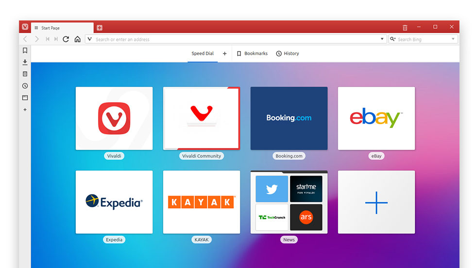
For example, Vivaldi has a narrow panel down the left side giving access to a range of features that pop out into a side panel. You can pull out bookmarks and quickly access them, see what’s been downloaded, view search history, view tabs and make notes. The latter is particularly useful for anyone who likes to jot down ideas while looking at a web page. Notes can incorporate full screenshots or grabs of a specific screen area, files can be attached, and — new in the latest version — there is markdown support.
Vivaldi Browser Begineers Guide
You can add a URL to this panel. This might be useful for always-on monitoring of social media feeds, although of course it does mean the main web browsing window is narrower than usual. You can move the left-hand panel to the right side of the screen if you prefer — this is one of a myriad settings you can tweak so that Vivaldi works the way you want.
Along the bottom of the Vivaldi window there’s a screenshot button, a toggle for loading page images and playing animations that might come in handy if bandwidth is low, and a button that accesses a host of page controls including pushing a page into black-and-white, removing transitions and blocking third-party content (ads); there’s even a CSS debugger for the devs among us.
[Source]
Vivaldi Browser Reviews
posted on 2018-04-27 15:45:11:

“As soon as you finish installing Vivaldi, the initial setup process prompts you to make several choices over the way it looks and functions like where you wish to place the tabs bar, your theme, and other aspects. This approach to customization makes it so it’s very unlikely that any two users of the browser will have an identical looking browser. However, the ultimate number of customization options falls short of the more personalization oriented Firefox while still ending up potentially too complicated to the least tech-savvy of chrome users.
Being founded by the co-founder of Opera with a team of its developers, it shows its origins in its visual design more than in anything else. However, it introduces some extremely useful new features in a well-integrated way that keeps it far from being a rehashed Opera browser. One signature feature of the browser is tab stacking, accomplished by simply dragging and dropping tabs above one another. This I find very useful when multitasking as I can organize the heaps of tabs that accumulate categorically. However, what’s an even more productive Vivaldi feature is tiling tabs. If you’ve ever used a tiling windows manager, a multi-screen setup or done translation or programming work on a computer, you’ll know the type of productivity boost viewing different windows side-by-side can provide. With more and more of our work being done on the web, this is a much-appreciated new feature, at the very least by people who share my same use cases.
Another two features of Vivaldi reside in its sidebar, where along with bookmarks, history, and downloads, you can access a notes-taking interface that is convenient and useful. The second feature of this sidebar is Web Panels, which is somewhat reminiscent of Opera’s Whatsapp and Messenger integration into a sidebar, but instead allows you to basically open mobile or stripped-down versions of sides in a resizable strip of your screen’s real estate. I personally find this feature redundant considering the browser’s tiling tabs functionality.
Although from the settings menu alone, Vivaldi’s user interface appears to be rich in customization options, especially compared to Google Chrome. However, the degree of customization can’t even be compared to that offered by the Firefox about:config page to power users. This challenges its claim to being a customization oriented browser for power users, from my perspective. In addition, it can only keep up with the Chrome in capability by supporting add-ons from the chrome store, which is another way it falls behind Firefox in terms of functionality, the latter being capable of the insane feat of running a web server as an add-on. All this leads me to the conclusion that Vivaldi’s focus on personalization is more of a superficial visual one and it being aimed at power user is little more than a marketing scheme.
Performance-wise, Vivaldi is neither bad or exceptionally good. As far as published benchmarks you can find, Vivaldi never scored best or worst scored compared to other browsers. From my own experience, it tends to excel at what Chrome excels at, like DRM streaming sites, youtube and opening large files using Google services but falling behind Firefox in handling complex Javascript.”
[Source]
TAGS: VIVALDI WEB BROWSER DOWNLOAD


